There's a term I read about a long time ago, I think it was "aesthetic completeness" or something like that. It was used in the context of video games whose art direction was fully realized in the game, i.e. increases in graphics hardware or capabilities wouldn't add anything to the game in an artistic sense. The original Homeworld games were held up as examples.
Anyway, this reminded me of that. Making these pictures in anything but the tools of the time wouldn't just change them, they'd be totally different artworks. The medium is part of the artwork itself.
The same holds true for everything from cave paintings to Roman frescos. It's part of human expression. The tools of that expression shape it.
For example, Bach's music was shaped by the fact that the harpsichord had no sustain. The piano changed that, but "upscaling" Bach's work to take advantage of this new technology would destroy them. You use the new technology to play them as they were written for the old. The beauty comes through despite the change.
Similarly, Liszt made full use of what modern, powerful pianofortes are capable of - although were he a man of our times, he’d probably have been fronting a heavy metal band.
I have to imagine that fully realizing a vision can only truly take place when the artists are not working at the limits of the present day tools. I’m thinking of something like games today that choose an art style and run with it, rather than trying to push the hardware as hard as possible.
Was this the artist’s vision, or were they simply making the best of the tools they had?
Pixel art is very much still around today, even though it's far from "pushing" the limits of current hardware. It's pursuing a rather consistent "vision" of maximizing quality while staying within the bounds of a predefined level of detail (i.e. resolution) and color depth.
Right. This is kind of what I’m talking about. Someone choosing pixel art today is making a choice; they have a vision. 40 years ago, they were limited by the system. The choice was largely made for them.
Old video games come to mind. The box art would be drastically different than the look of the game. The box art was the vision, the game was what they ended up with after compromises due to the hardware of the day. I think it’s only been in the last decade or so that some game makers have truly been able to realize the visions they had 40 years ago.
I think of the box art and physical manual of a video game like Diablo from 1996, compared to the game itself. The manual had several detailed drawings of monsters and otherworldly creatures with a very "evil" look, but the game itself they were represented as blocky sprites with fairly comical movement, as characters moved on a isometric chessboard-style grid, with abrupt turns and limited speed. Ultimately the gameplay is what mattered, the box art, in-game music and sound effects all created an atmosphere that wouldn't have been as immersive with just graphics.
A point of comparison would be to the game Quake, which came out the same year, and whose graphics felt light years ahead . But Quake mostly became a multiplayer hit, as the single-player story and overall atmosphere weren't very compelling.
Even today these pictures have an almost perfect resolution for showing on a compact e-paper display. The viewing area on the original Mac models was not that much bigger, either. They only look "horribly pixelated" when artificially upscaled for a modern big screen.
(A pixel-art specific upscaling filter would mitigate that issue, of course.)
Of course there's a subjective element, but I was born about a decade after these were created and I find them to be beautiful. I love the mural with the tree, it's amazing how it creates a sense of openness that wants me to go outside, even with such a limited palette.
Awesome! You can also find great art made with Deluxe Paint for the Amiga. The limitations from early computers in resolution and, most importantly, palette, create unique art styles:
They have more color but way less resolution, thus less detail. Pretty much what you would expect to see, given that the original Mac and Amiga came out around the same time.
Both Motorola 68000 machines, typically 512K-1024K of RAM. So similar underlying constraints, under which they made very different choices for how to prioritize graphics.
I envy that small world, where people could be this genuinely enthusiastic about their computer products and companies, where most actors seeked the best interest of other parties.
I was born in ‘83 and a good chunk of my formative years were spent imagining the world through dithered pixels — playing games, creating art, writing, and exploring. Seeing these images evokes a rush of nostalgia, simply because they’re dithered.
Really interesting. I’m wondering if there’s any LLM or image model on Hugging Face that has been trained specifically on low-res black-and-white images like MacPaint. Has anyone come across something similar or seen a fine-tuned model in this specific retro visual style?
The lack of photorealistic fidelity gives your brain a bit of room to use imagination to fill in the blanks in your internal model. This fosters a certain type of engagement with the content that you don't get with photorealistic images.
For me, there's a certain aesthetic to 1-bit bayer-dithered images, as well as images with visibly big coloured-halftone-dots, that makes it feel both retro and modern at the same time. I want to call it neo-retro, but I feel like that term already exists.
At the end of the article they mention digging in to the Amiga scene. If you want to feel old, Deluxe Paint turns 40 this year. My mates had Amigas (I had an Amstrad) and the computing world just felt full of wonder and promise. It was a magical time of creation.
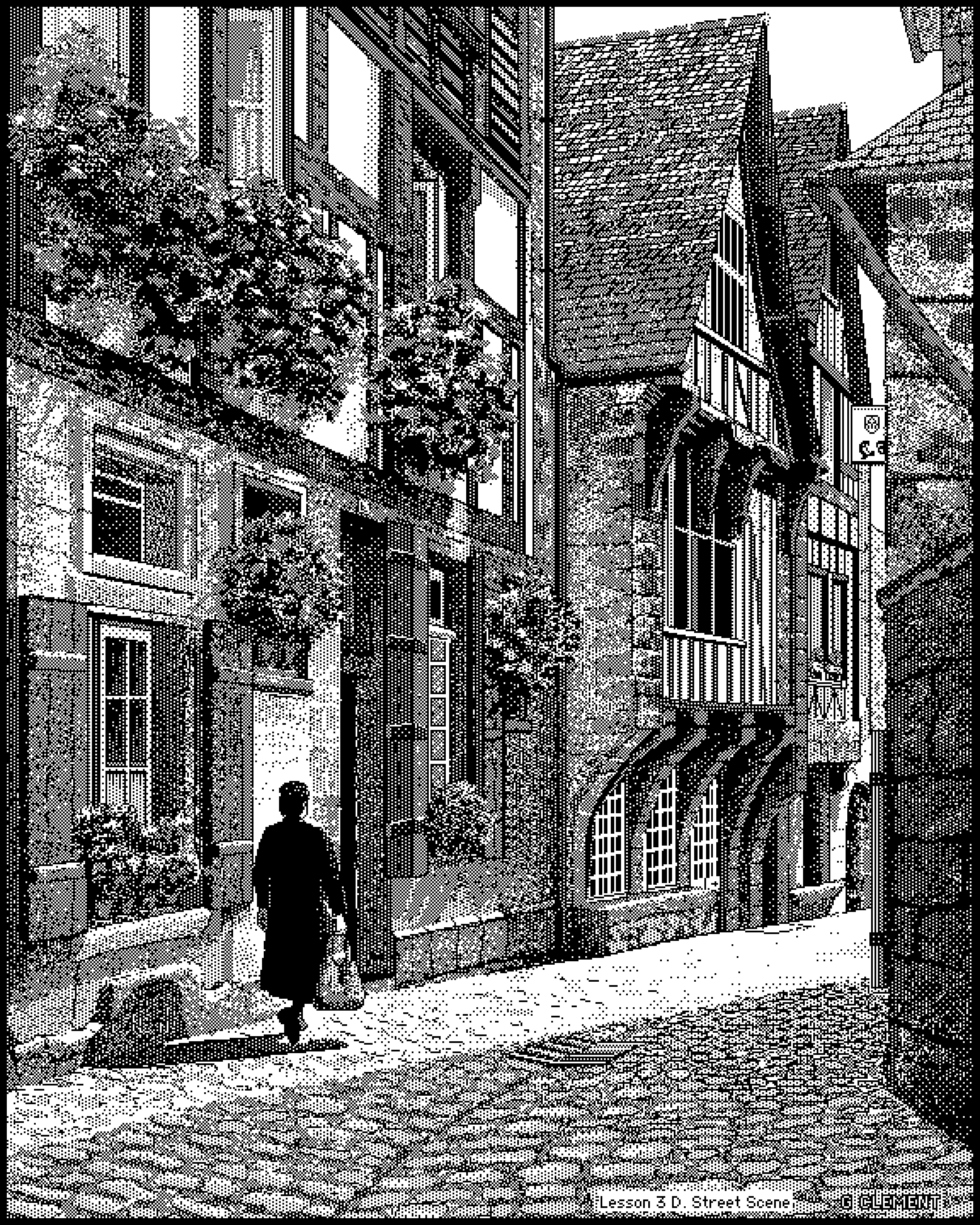
The street scene is by Gerald Vaughn Clement, the inventor of MacGrid, a drawing program that used a sort of plastic grid to perform high detail drawing and digitization.
(From page HTML source)
<!-- ******** HELLO OLD COMPUTER USERS ******** -->
<!-- This site is designed to be viewable at 640x480 resolution or higher in any color mode in Netscape/IE 3 or any
better browser, so if you're using an LC III or something, you're welcome. In fact, I really hope you are using such a machine,
because limiting the site to this level of simplicity wouldn't be worth it unless someone is. Please let me know if you are
using an old computer to visit the site so I know it is worth it to someone to maintain this compatibility. I do
apologize for the one javascript error that you may get on each page load, but I don't expect it to cause any crashes.
The major exception to all of this is Netscape 4. That thing sucks. -->
If I'm not mistaken Netscape Communicator was just a pack of different applications, including NN. The real issue seems to be was specific CSS and some style rendering.
These really need to be viewed with a CRT renderer IMO, as well as the Amiga art mentioned in this thread. The hard square pixels on the website aren’t quite representative of what these looked like on a contemporary monitor.
Up to a point, but the early Macintosh displays were quite crisp and clinical—certainly compared to something like a consumer NTSC or PAL CRT TV—as befitted a platform which was very focussed on WYSIWYG paper-document editing.
"Laurence Gartel, Bert Monroy, and James Leftwich helped pioneer digital art in the 1980s and continue to be active in creative fields today. Gartel, a digital art trailblazer, now serves as a brand ambassador for AI painting firm Robohood, exhibits globally, and is producing a multi-volume encyclopedia and documentary on his work. Monroy, known for hyper-realistic digital paintings, was inducted into the Photoshop Hall of Fame and continues to teach and create through platforms like Lynda.com and “Pixel Playground.” Leftwich, who created intricate MacPaint works like “M-Aura,” now works as a user-experience designer in California and is active in the visual poetry and asemic writing community. All three artists exemplify how early digital tools sparked long, innovative careers."
The 2nd artwork ('A Door Somewhere " - Bert Monrov) had me really confused for a moment.
When I scrolled down to it, there was a sort of flickering effect, like as if it were a gif, with a flickering light adding ambience to the scene.
But no, it's just how that sort of black & white shading looks when you scroll past it - amazing effect!
I know; I mean to say they're larger file sizes—the PNG compression ratio is effectively less than one.
Take the first one, "acius.png", at 84,326 bytes. If you losslessly scale back to the original size (1/4th) and convert to 1-bit NetPBM, it's 51,851 bytes, without compression. I thought that was remarkable.
Meh. It was nothing compared with PLATO systems at the university. And the CAD setups dad and his engineering team used for work then (Silicon Graphics?) also looked much better.